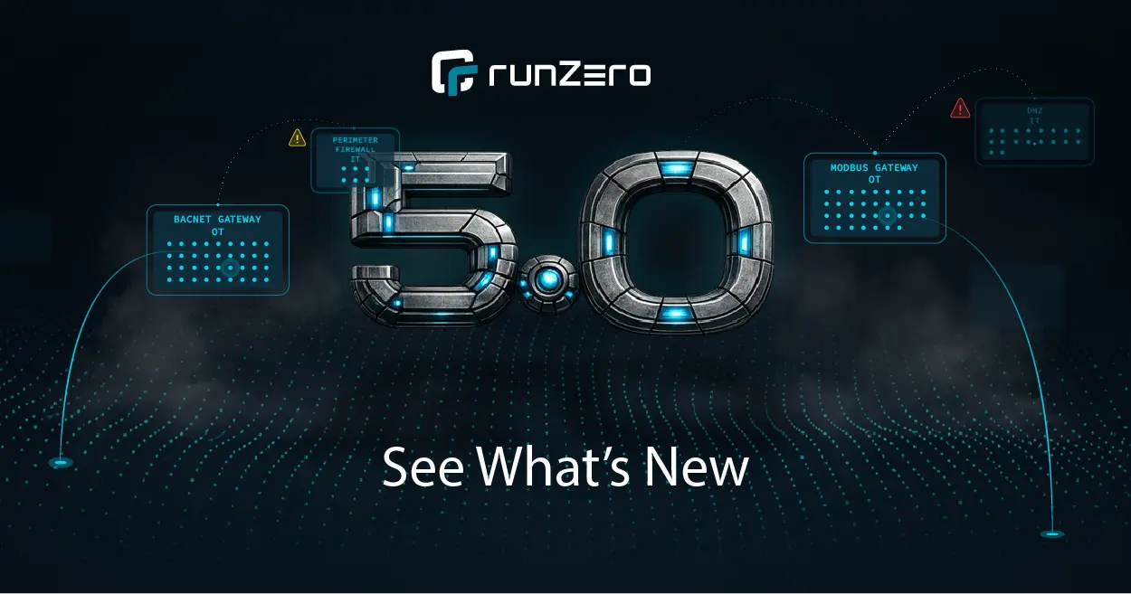


Our big announcement is finally out: Rumble is now runZero! Along with a new company name, we wanted to refresh our look as well. We’re talking about everything: logo, colors, typography, UI enhancements, etc. In this post, we’ll share our approach to designing our new logo and improving our product UI.
Designing the runZero logo #
There were enough similarities between runZero and Rumble for us to keep the concept in the new logo–if we wanted. But it wouldn’t have felt like we did enough to capture the evolution of the company. We knew this was an opportunity to create a distinctive logo that truly embodies our brand.
We wanted our logo to be bold, easily recognizable, and true to us. Because of this, it was important for us to do the creative work in-house with our small-but-mighty team. We created hundreds of logos and multiple variations. After three weeks, with lots (and lots) of input from our stakeholders, we finally created THE ONE.
Introducing the one, the only: runZero logo #
They say when you meet the one, you just know. And we did.
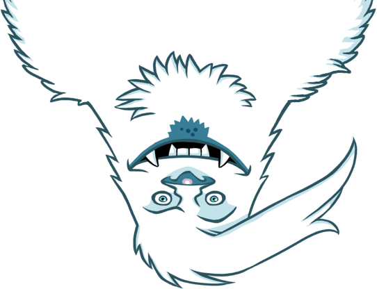
We are so proud to introduce our new logo:
While the other logos that made the final cut were good, they just weren't memorable. For our requirements, our logo also needed to work consistently in different contexts and scales. The logo needed to stand out in a crowd of logos, and the glyph to be able to stand on its own without the wordmark.
The glyph itself needed to stand out at a smaller size, especially within our product UI. For example, when users explore their asset inventory and look at the data sources column, they need to be able to identify the runZero glyph at a glance.
To ensure the design was perfect, we created a custom grid to ensure each pixel and space between characters were exact. The glyph is a combination of the “r” and “zero” from our wordmark with a slight skew to add a sense of dimension. The wordmark is created using Orbitron font, with a customized “E” that emphasizes runZero’s speed and represents a server. This style choice further connects the logo to our product. The logo uses two of our new brand colors: Atlantic and Midnight.
The intensive design and thought process helped us ensure that our logo can easily scale and work in many places. We could keep going about logo design, but let’s talk about our UI enhancements as well.
Making the UI pop #
Earlier, we mentioned our new brand colors. We have a completely new color palette, which you can see across our UI components. The majority of our new colors pass the WCAG guidelines.
Our primary brand colors are a combination of teal (Atlantic), green (Seafoam), and dark blue (Midnight), which you'll see across our product and website.
Our secondary colors of yellow (Gold), pink (It's pink!), and white (Snow) add an extra pop of contrast throughout:
As you may have noticed, the runZero product UI has a new look and feel. Primary buttons are now teal, the charts showcase our primary and secondary brand colors, and the side and top navigation use a very dark blue. The error text…well, it’s pink; you won't miss it.
In the 2.15 release, we made significant improvements to the performance and design of our inventory tables. We increased the number of results that can be listed in the tables and improved performance of tables with high row counts. The pagination is now more clean and simplified.
In addition, we've combined the results sections and moved it to the top right of the data table. By consolidating the results in one place, we’ve made it easier to reference. It doesn't just stop at improving inventory tables. We are updating all our data tables! All these enhancements will make viewing and querying results more efficient. Keep an eye on the data tables over the next few releases.
Stay tuned for more #
Along with these recent changes, there are many exciting enhancements coming to our product. This is just the beginning. Keep an eye out for more UI changes in our upcoming releases.